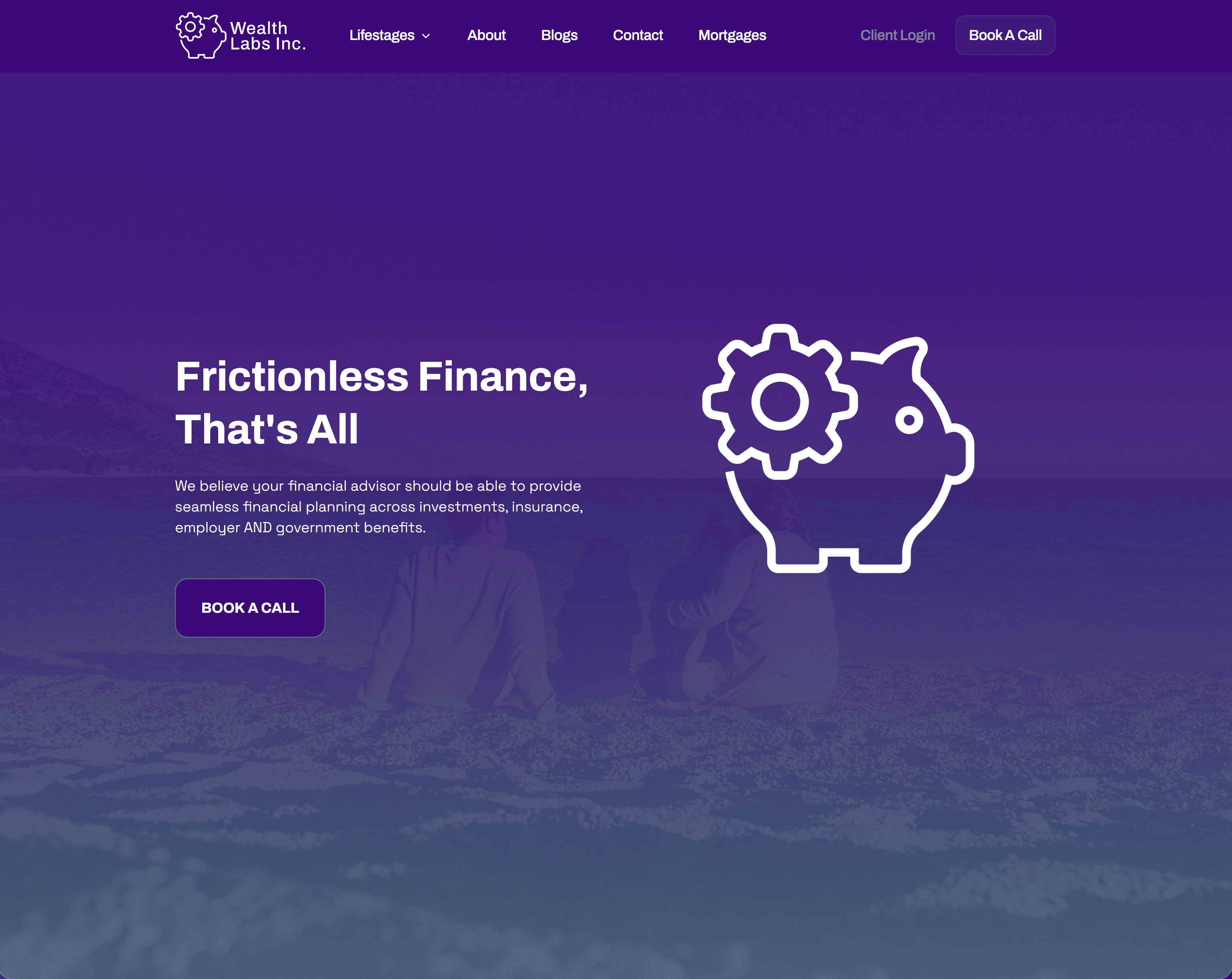
From traffic without traction to a site that converts
Click here to view websiteWealth Labs was already doing the right things. People were finding the site. Traffic wasn't the problem.
But visits werem't turning into conversations. The site had an audience – it just wasn't giving them a clear enough reason to take the next step.
At the same time, the business was evolving. Wealth Labs was moving into a new office, stepping into a new chapter, and the exisiting site no longer reflected where the firm was headed.
It was time for a rebuild that matched the ambition behind the business.
Financial advisory is one of the most crowded, undifferentiated categories online. Most advisor sites look and sound the same – generic promises about "growing your wealth", generic colour schemes, and a contact form buried at the bottom.
The result is a market full of capable advisors that prospects can't tell apart.
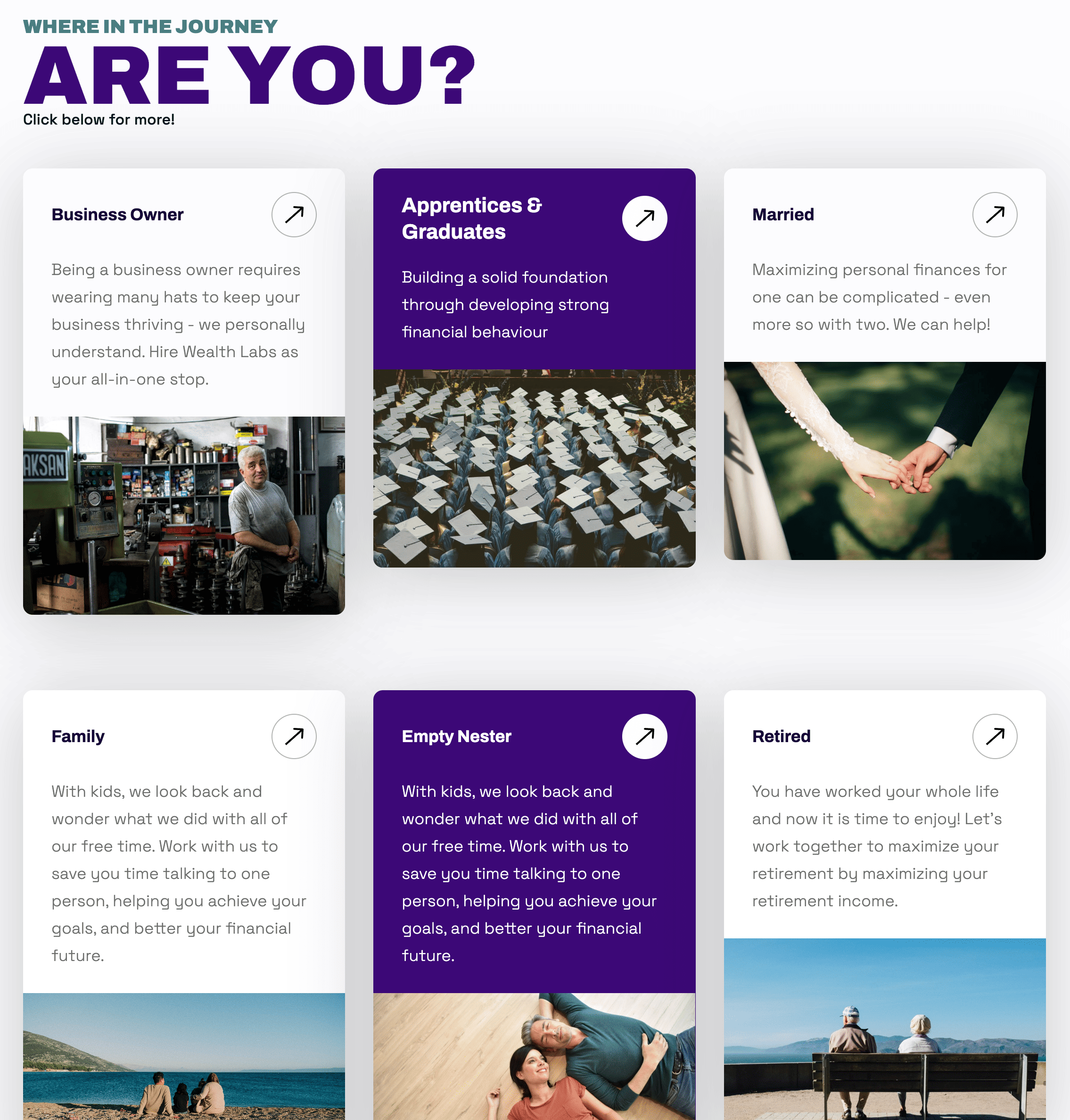
Wealth Labs had a clear differentiator: a life-stage approach to financial planning that meets clients where they actually are – not where a product menu assumes they should be.
The previous site had the bones of the idea, but the messaging wasn't sharp enough to make it land.
Visitors were arriving, looking around, and leaving without acting. Not because the offer wasn't right, it's because the site wasn't making it obvious enough, fast enough.
The strategic priority was clarity before everything else.
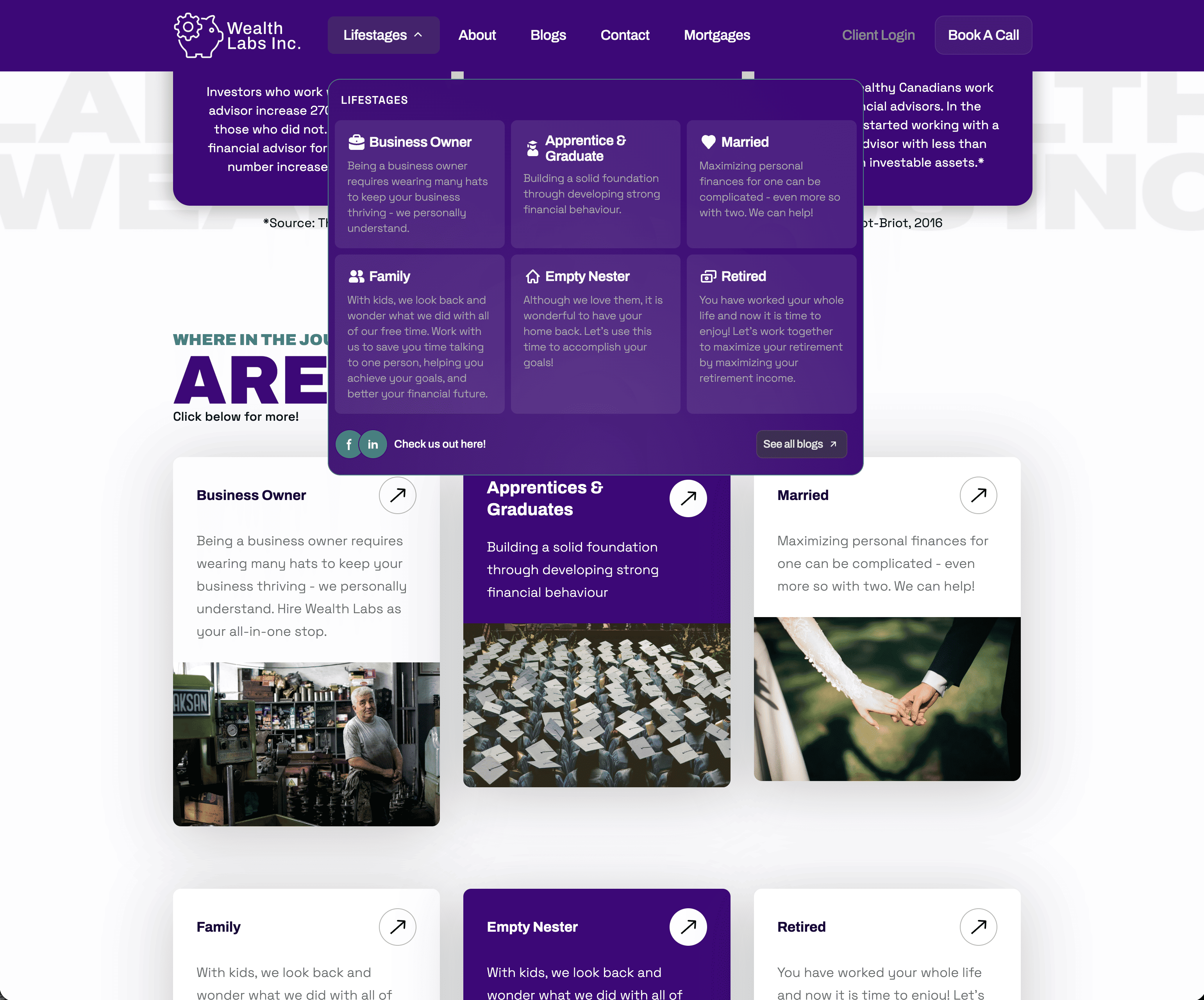
The life stages framework – Business Owner, Apprentice, Married, Family, Empty Nester, Retired – was already present in the previous site.
Rather than replace it. the rebuild doubled down on it. It's the right idea, it just needed sharper execution.
Structuring the site around life stages does something most financial advisor sites don't: it immediately answers "is this for me"?
The visitor self-identifies, finds their context, and feels understood before they've read a single line of copy.
That's the foundation a conversion is built on.
Everything else – the statistics on advisor value, the blog content, the consistent CTA to book a call – was built to reinforce that foundation and reduce the distance between arriving on the site and taking action.
A full redesign and rebuild organized around the decision a prospect is actually making: not "should I get a financial advisor" but "is this the right advisor for where I am in life right now."
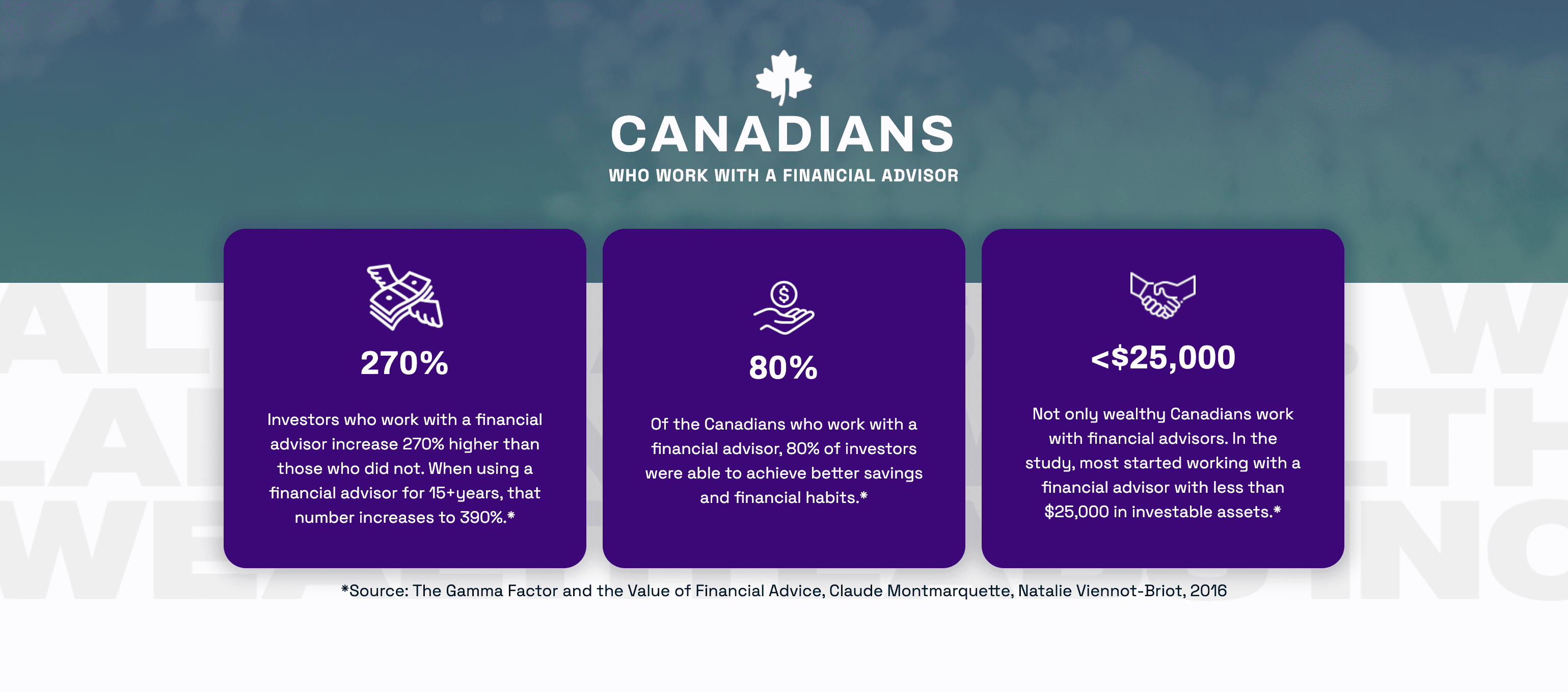
Clear, consistent pathways for each life stage. Data backed credibility signals placed early to answer the "is this worth my time?" question. A single, repeated CTA – book a call – that removes ambiguity about what happens next. A visual system that feels modern, trustworthy, and distinctly not like every other financial services site.
The result is a site built for conversion, not just presence.
Qualified inquiries through the website increased after launch.
The client – a CFP with a growing practice, a new office, and a clear sense of where the business was headed – now has a digital presence that reflects all of it.
Traffic without clarity is just noise. When visitors can see themselves in what you do, the next step becomes obvious.
I help capable businesses clarify their position –– then build the brand and infrastructure that turns that clarrity into predictable revenue.


